
Projects
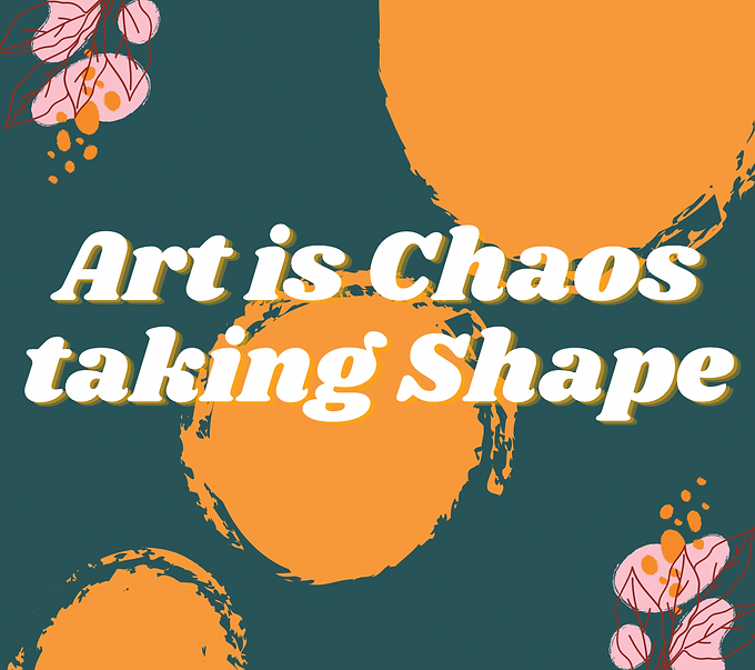
Art is Chaos (Graphic Sample 1)
Making this graphic was very special to me because I am progressively learning how and why I want to be creative and this graphic was a spontaneous burst of my artistic abilities. Hence, the quote "Art is Chaos taking Shape". I really love the use of contrasting colors with accent outlier colors in the corner.
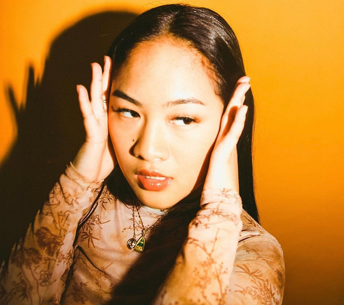
Vibrant Hues (Photo Sample 1)
The photo above is from a photoshoot with my colleague who helped me create a bright and bold look. The idea behind the shoot was to have orange and tan tones with a pink lip to give pops of color.

Rejection is Redirection (Graphic Sample 2)
This Graphic design was made when I was experimenting on how I wanted backgrounds and words to flow together. Therefore, I made sure to make a background that was subtle which allowed for the bolded quote to stand out. I also thought that the quote itself stood out to me because of the powerful messaging that life will have its ups and downs
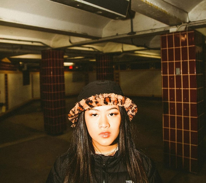
Underground (Photo Sample 2)
This photo was taken in the Philadelphia subway station. My idea behind the look was to give warm city vibes. I also think the muted red tones and the brown on my hat gave the look a very strong vintage look to it.
.png)
Retro Cosmetics (Logo Sample 1)
This is a logo I made that was inspired by a fictional beauty cosmetics brand that is trying to attract more consumers. The brand personality is fun and funky. Therefore, I wanted to embody this in the logo as well which is why I named the company Retro with a lighthearted pink background but bold letters for the logo
.png)
Pisces Cafe (Logo Sample 2)
This logo was created with a fictional cafe in mind that is centered around astrology. Therefore, I made the logo based off of my zodiac sun sign; Pisces. I think the contrasting green and orange-tan provide an earthy brand which correlates to the vegan cafe menu.

